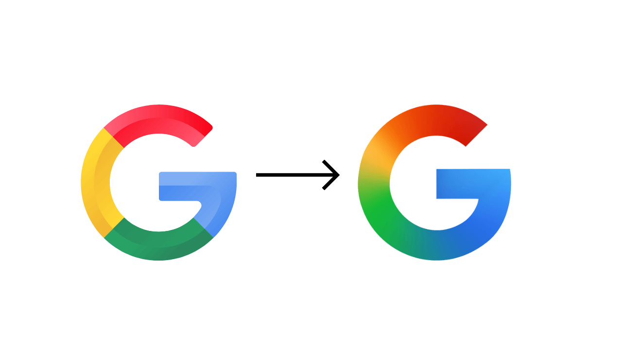
For the first time in a decade, Google has changed its “G” icon design with a new gradient design.
On September 1, 2015, Google dramatically modified its logo (‘Google’) with a new design called Product Sans. As part of it, the ‘G’ graphic evolved from a lowercase white ‘g’ on a background of blue to the round form we’ve seen for the past decade.
His old design of four solid colour blocks, i.e. Red, Yellow, Green, and Blue, to a fresh gradient colour design with the same colour combination.
This new logo design represents that the Google icon is more focused on Artificial Intelligence (AI). This modern colour is in line with its own Gemini gradient.
Gemini’s logo already has a blue-to-purple gradient, indicating that Google’s visual identity is shifting toward dynamic, gradient-based aesthetics.
This new updated design has already been rolled out for ios and Pixel users of the Google search app. Its deceptive change in logo was not immediately noticed by users, especially on the home screen.
Google’s new icon for other versions and models, like Android, is expected to be launched in the coming weeks.
Google does not appear to be upgrading its main six-letter design today, and it is unclear if any other product logos are altering.
In theory, several of the company’s four-colour logos, such as Chrome or Maps, might easily begin flowing in their respective parts.
No Change on its Google Wordmark Till Now
There has been no official announcement to make changes to its Google Wordmark logo design till now.
Also, not for any other product or service of Google.
Read More- https://hindiakhbarr.com/


buy antiques Online
Upon reflection, I felt like this article is timely and relevant.
Thank you exceedingly for writing this article; if more people wrote intelligent and time-worthy prose, I think everybody’d all understand life better.
I, personally, think we should place our attention more on fitness and diet and free from
being perpetually on the computer or I-Phone screen. Going
outside (and not being glued to the cell phone all the while,
either) and living life with appreciation for Nature, helps people feel sane
and feeling joyous. Considering deep philosophical memes is likewise an experience
that can aid us know ourselves.